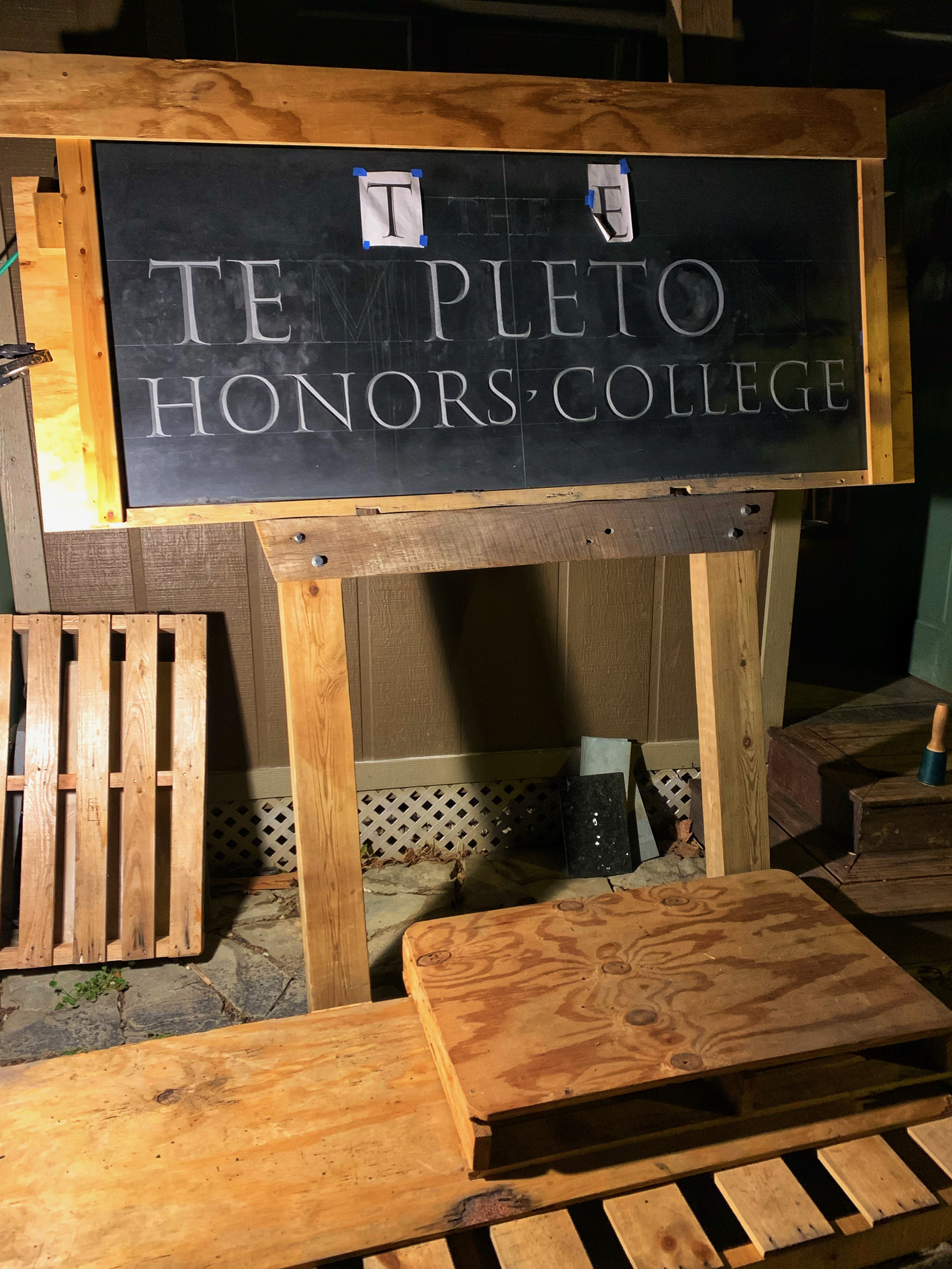


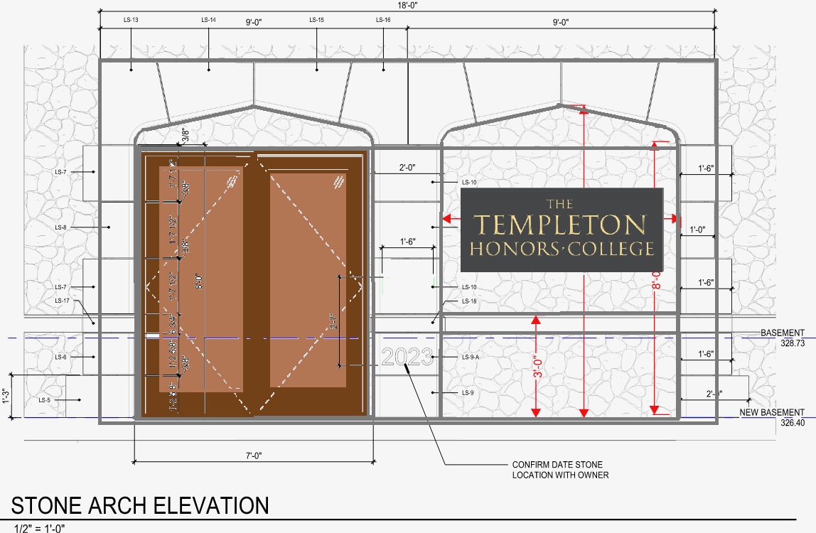
Tim Feist is a true craftsman. Stone-lover, hammer wielder, and sage of typographical knowledge from early Rome to Medieval Gothic to the nineteenth century masters William Morris and Eric Gill. And he is currently engraving and gilding a 72” x 30” slab of Monson slate for Templeton Hall. Under its stone tower and peaked arches, his hand-chiseled work will accompany the grand entrance to Templeton Hall and announce its occupants: “The Templeton Honors College.”
Tim and I met one evening in 2024 after I admired the marble English, Latin, and Greek lettering that hung in a friend’s office. He mentioned the stone carver would be joining us later that evening and that we should meet. So around an open fire on a cool night with a warm pipe in downtown Annapolis, MD, I met Tim Feist and our conversation about stone and letter began.
In early spring 2025, I then found myself driving across Algeria to explore Roman cities St. Augustine would have visited, including Thagaste, Timgad, and Djemila, culminating in Hippo Regius on the northeast coast. I sent Tim pictures of in situ Roman lettering from each place and we began considering the possibility and promise of adopting a North African typeface associated with St. Augustine for our engraving. This connection is not accidental. Templeton explicitly locates itself within the Christian intellectual tradition partly founded by St. Augustine, and his works The Confessions, de Doctrina Christiana, and The City of God feature prominently in our curriculum and intellectual landscape.
A few conversations later, a quarry was chosen, a stone was ordered, and Tim set to work. At every step along the way, Tim has shared pictures and videos with me: from the stone’s boxed arrival to his first hammer blows to the now waiting-to-be-gilded finished lettering. As the craftsman caring for the stone and coaxing letters out of it, I asked Tim to pen a few words about this 200-pound rock dug from the earth soon to become a focal piece for our beloved college.
From Tim: “Our sign is made of American slate from Monson, Maine. This is the same stone used for John F. Kennedy’s grave marker at Arlington National Cemetery. We selected it for several reasons. Its gray color complements Templeton Hall’s façade masonry, which is light-colored stone in variegated tones, rough-cut and loosely masoned. And the slate’s dark, smooth, homogenous surface provides a visual contrast, clearly defining the sign boundaries against the lighter, mottled background.
Slate also provides material benefits. It weathers exceptionally well. Letters cut in slate will remain crisp and legible for centuries. And its structural qualities allow it to be cut thin, so that it’s easier to integrate into the surrounding masonry.
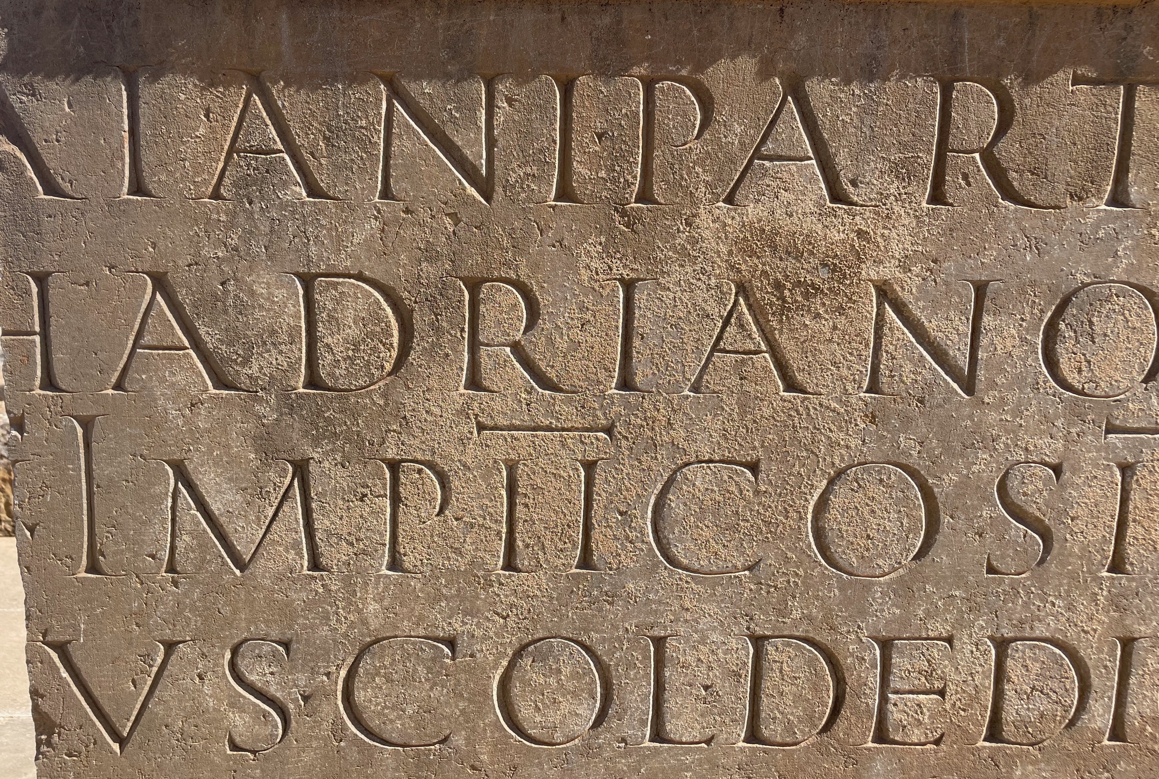
Dean Williams wanted lettering that honored the Christian and classical roots of Templeton’s curriculum. We based our design on an ancient Roman marketplace inscription from the ruins at Timgad (Colonia Marciana Ulpia Traiana Thamugadi), a frontier city built by Trajan in A.D. 100. Timgad is near Thagaste, St. Augustine’s hometown, and Hippo, where he was bishop for 34 years. So it’s likely that this inscription would have been a familiar sight to St. Augustine as he visited the Timgad marketplace, first as a boy, then as a bishop.
The letters were Roman capitalis monumentalis, made in exactly the same way as the imperial inscriptions on the Trajan column in Rome. Like the Trajan letters, the Timgad letters were first written onto the stone with a chisel-edged brush, a method that creates sinuous curves, subtle flaring, and serifs (from the “cutting in” and “knifing out” of the brush edge). Where modern-day typefaces impose a uniform width on their letters, this tradition of formal Roman handwriting features variable widths (an E is much narrower than an M, for example) to achieve a vigorous visual rhythm. The Timgad inscription carries the elegance of this Roman tradition with a frontier swagger. The spacing and letter widths follow standard proportions but remain unique to the individual writer’s hand. And the letterforms themselves carry trademark quirks. A key example for our purposes: use of a "shouldered" (vs. pointed) “M” and “N” was a fairly common variation within the tradition, but the Timgad writer added inward-facing serifs on those upward points. This is a very unusual flourish and may be unique to the Timgad and North African region.
That said, I was delighted to find that ‘Stevens Titling’ font, written by American calligrapher John Stevens in the 1980’s, mapped very closely onto the Timgad letters. Somehow the two writers, separated by millennia but united by tradition, shared the same stylistic personality, the same skillful openness, the same forthright vigor that you will see in the Templeton inscription along with Timgad’s trademark inward-facing serifs.”
Thus, Tim. Templeton alumni will readily see why we chose Tim Feist to create this new and enduring symbol of The Templeton Honors College. The same open vigor, skilled craftsmanship, and attention to tradition that Tim finds in the Timgad inscription, we found in Tim, along with a loving attentiveness to the material world, a passion to share his passion, and a desire to carve for the ages. Shopclass as soulcraft, right?
This July, Tim’s beautiful work will be placed in situ in Templeton Hall, where you will be able to run your fingers through the letters to feel every chisel mark struck by Tim, chisel marks from chisel blows that echo across space and time from North Africa and the home of St. Augustine to St. Davids and the home of The Templeton Honors College.
Dean Williams
(If you have a project for Tim, let me know. He has hammer and chisel in hand ready to go.)